

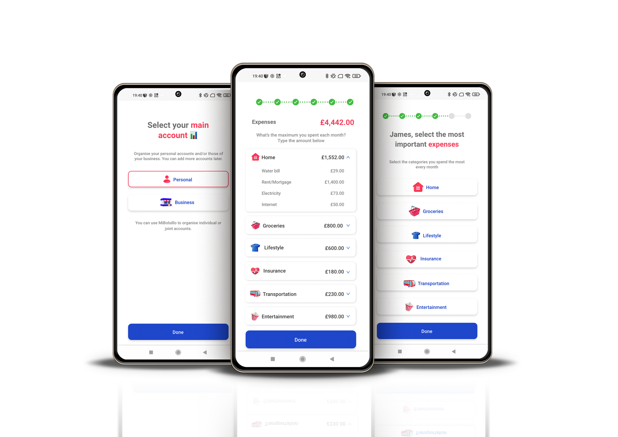

Summary
Client: MiBolsillo App
Sector: Fintech
Challenge: Increase the stickness ratio (DAU/MAU) and reduce the number of drop-offs after the budgeting process flow.
My Role: User Experience Researcher and Interface Designer
Table of Contents
① Background Analysis
② The Design Journey
ⓗ Usability Testing Sessions >
③ The Final Product

Downloads vs Active Users
My starting point for this use case was to analyse the metrics provided on Firebase. MiBolsillo app had a high download number suggesting initial appeal, but it didn’t have a substantial number of active users to maintain long-term success and ensure retention and ROI.
Firebase Events
After assigning events to every core app functionality, it was clear that the budgeting process was a central pain point among our user base.
Competitors Analysis
I analysed the budgeting flow of leading banking apps in our market. The apps included were, Yape, Tpaga, Organizze, Fintonic and Monefy.
The personal finance app market is dynamic, with new players entering the space regularly. Factors such as target audience, specific features, and market presence can influence the competitive landscape in a given region.
Key findings
-
No technical jargon leaking into the user interface
-
Show users how long they have left
-
Don't overload users with loads of information all over the UI.
-
The flow shouldn't exceed 60 seconds.
In-app Survey
Alongside the Firebase events, I ran an in-app survey among our users to understand what functionalities our userbase appreciates the most.
The responses suggest a demand for easier access to loans and budgeting tools.
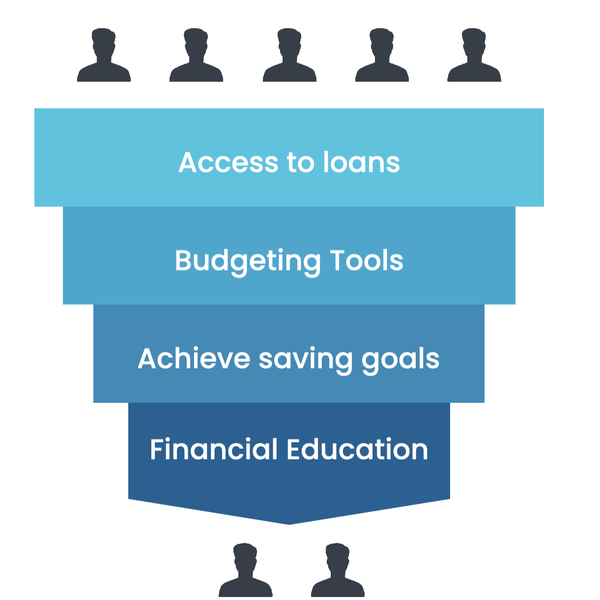
The survey results revealed the need to improve the in-app budgeting tool dramatically.
Empathise Phase
My team and I held user interviews and user testing during this stage. I conducted these sessions using low-fidelity prototypes.
User Interviews
I sent in-app notifications and e-mails to the most active users within our extended representative sample.
User Interview KPIs
ⓐ Identify Pain Points during the onboarding process.
ⓑ Understand the user's willingness to complete the process.
ⓒ Know what the expectations are afterwards
ⓓ To what extent are digital tools already being used for budgeting?
Insights
-
User say the budgeting process was long and complex
-
Users said they don't understand why they need to input so much data prior to using the app.
-
Users said they found the app terminology too verbose and in many cases lacked clarity.
-
The UI was perceived as dull and unpolished.
-
Users mentioned that many buttons were cut out, and others didn't respond.
Based on the interviews, I have modelled the following user personas ↓
Personas

Fiorella Harding
-
Age: 25
Education: Undergraduate
Hometown: Lima, Peru
Family: Single
Occupation: Temporary worker in a beauty salon
Mobile Platform: Android
-
Fiorella is a young woman working in a beauty salon. She lives in an urban area of the city of Lima. Currently, she wants to get qualified in Cosmetology so she can get a better job in the industry, be able to save money and in the near future open her own beauty salon. She enjoys going out on the weekends but she’s trying to do it less so can save faster to start her studies.
-
Fiorella wants to save money to carry on her studies in a Cosmetology School.
Fiorella wants to control her expenses and be able to cut off all non-essential ones.
-
Fiorella tried to apply for a loan but there were so many requirements that she gave up.
Fiorella doesn’t understand much about finances but she’s willing to learn the basics.
Fiorella downloaded a finance app already. It was so complicated and cumbersome that she stopped using it.

Federico Campbell
-
Age: 28
Education: Undergraduate
Hometown: Rosario, Argentina
Family: Single with a dog
Occupation: Owner of a food market stall
Mobile Platform: Android
-
Federico moved to Cusco from his hometown two years ago. He arrived as a tourist, fell in love with the city, and never left. He rents a small food stall in a very touristy market in the city. He cooks different kinds of vegetarian wraps - his customers love the mushroom one. The business is starting to grow and he would like to be able to better control the incomes and expenses. He dreams to have his restaurant in the heart of the city.
-
Federico wants to rent the food market stall next to him so he can serve more customers.
Federico is thinking of hiring a waiter to help him during peak times
-
Federico is busy most of the time and sometimes he forgets to pay his utilities.
Federico would like to apply for a bank loan. Unfortunately, he can’t prove his income to any bank in the country.
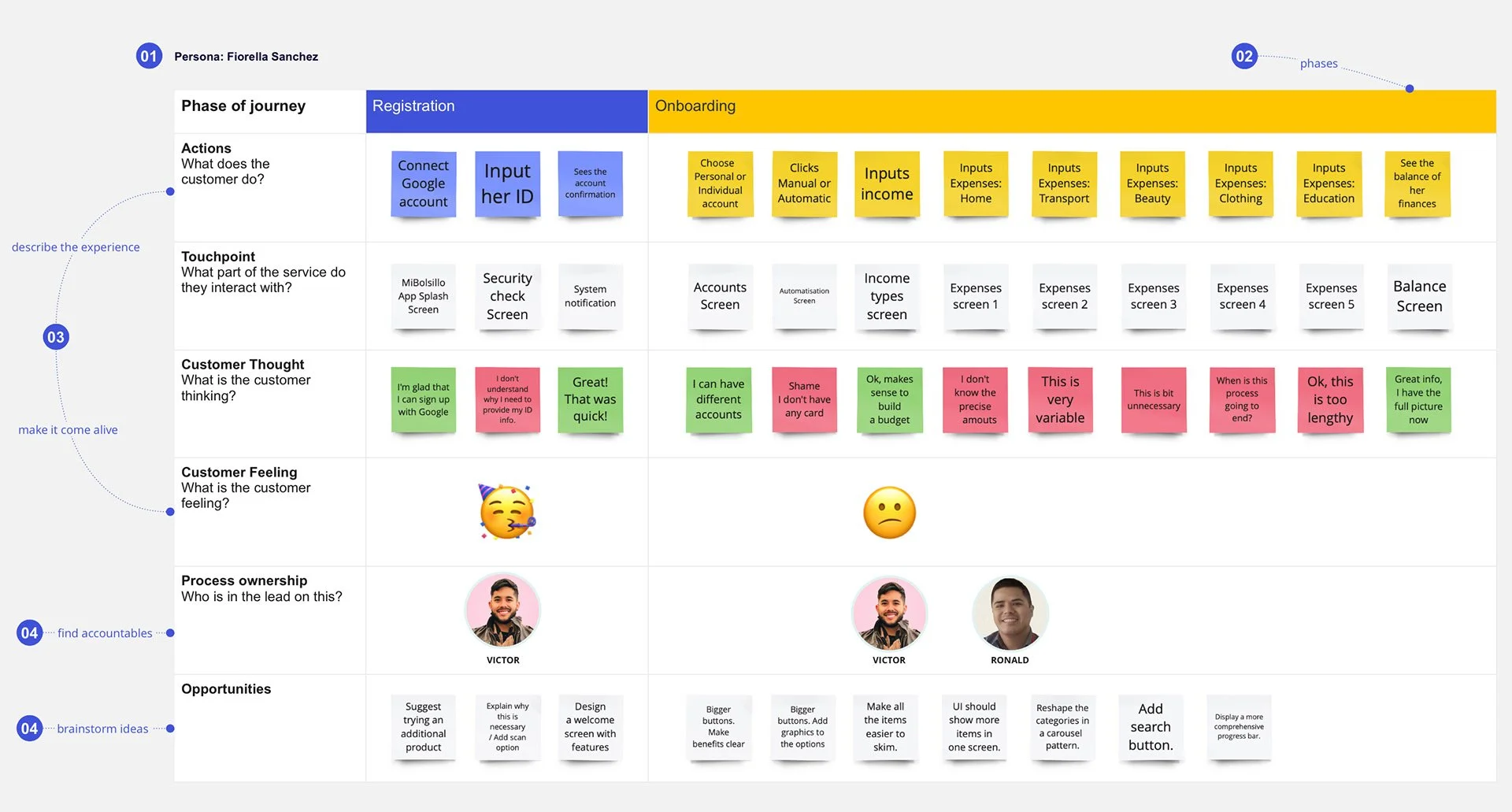
Customer Journey Map
User journeys are critical in designing apps. They highlight the current issues and produce a perfect picture from a typical user’s perspective early in the process.
I worked with my PO during this stage. We gathered a lot of ideas that we tested in the next stage.
Building the Information Architecture
For this purpose, I used card sorting as the method to design and evaluate the information architecture of the budgeting flow. In the card sorting session, the attendants organised topics into categories that made sense to them, and they helped me to re-label these groups.

These sessions made me understand our users' expectations and the categories' logic. This research helped my team and me to:
✔ Build the structure for categories and subcategories
✔ Decide the order of the items
✔ Label categories and navigation
The categories below are the result of multiple card-sorting sessions.
Categories Tree
-
Rent
Mortgage
Property taxes
Maintenance costs
Water Bills
Electricity
Internet
-
Supermarket
Convenience Store
-
Gym memberships
Clothing
Home Decor
Gifts
Delivery
Restaurants
-
Healthcare
Homeowner’s or renter’s insurance
Home warranties or protection plans
Auto insurance
Life insurance
Disability insurance
-
Bus
Train
Taxis
Uber & others
-
Concert tickets
Sporting events
Family activities & holidays
Netflix & others
Video games
Hobbies
-
School Fees
University Fees
-
Phone
Laptop
Desktop
Accessories
-
Item description
Wireframes
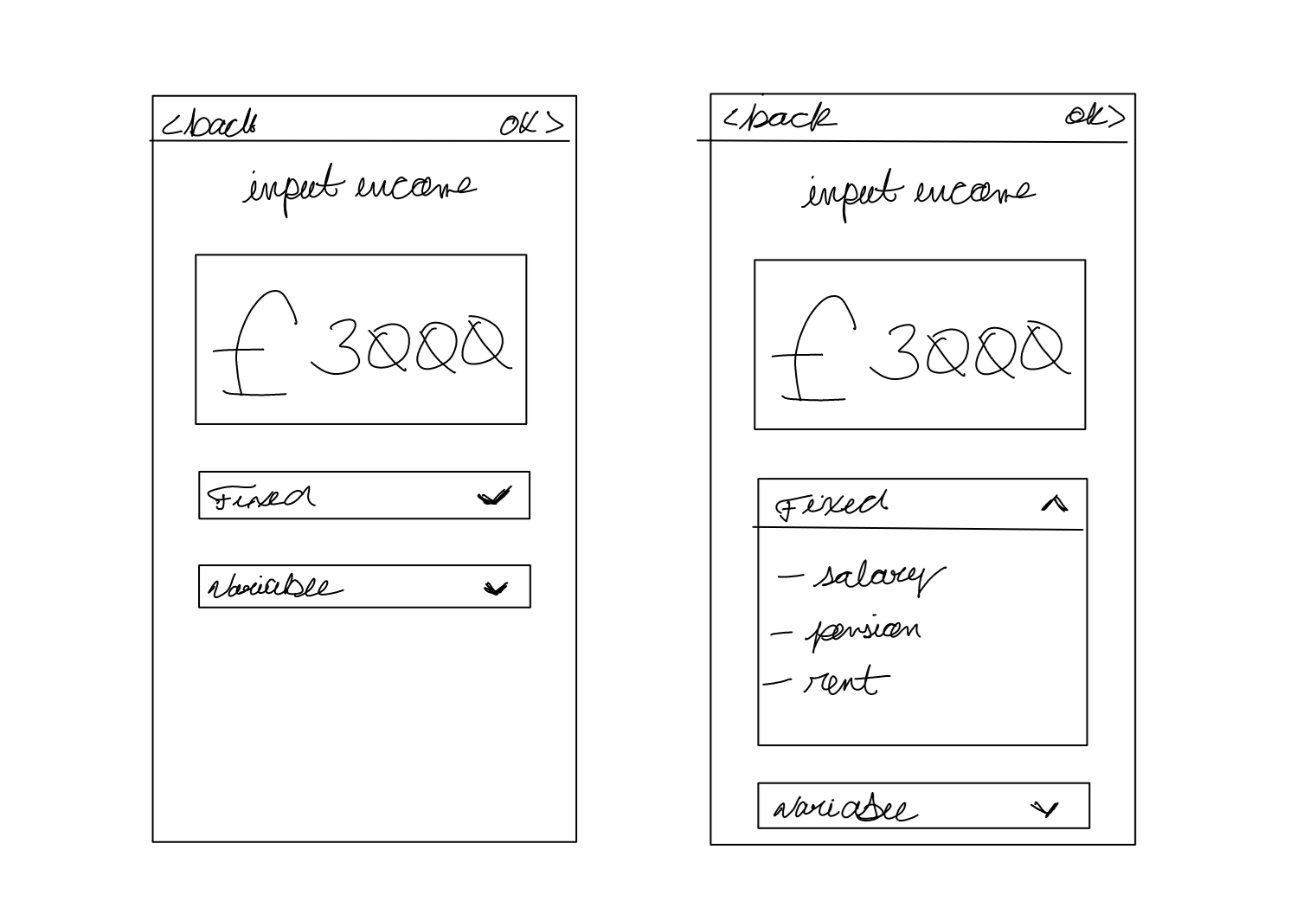
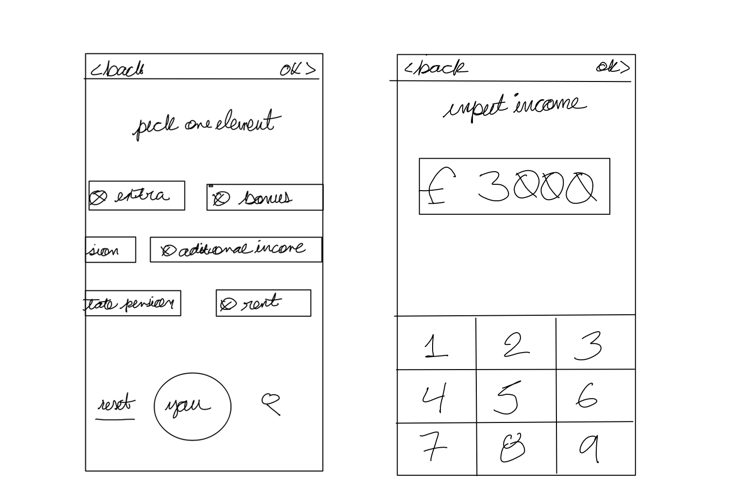
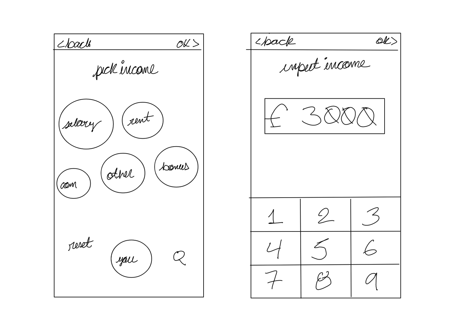
After gathering all the information from our users. I led the next phase. I created simple wireframes to discuss with my team which ideas to implement.
-
![]()
Dropdown menu
The dropdown shows the categories available | One screen format | No progress bar
-
![]()
Carousel Sketch
Sliders show categories available | Circular progress bar
-
![]()
Bubbles
Bubbles show categories available | Circular progress bar | Reset and search options
Usability Testing Sessions
I implemented these prototypes to go through the conceptual and implementation stages fast.
My team and I conducted several remote usability testing where the paper was not an option.
I did not spend time with unnecessary design elements that may be scrapped as you develop the front end.
The goal was to test the interactions of the final solution. This made it easy to gather many insights into user'’ conduct and interactions with the software.
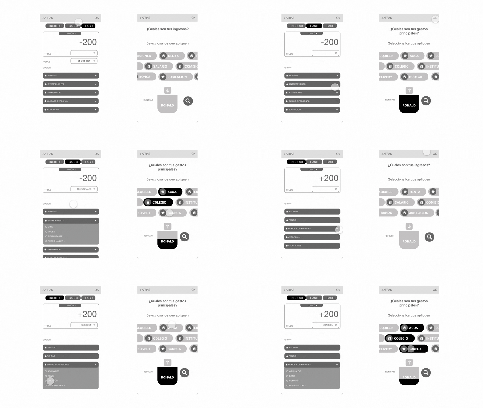
Insights of the first round of usability testing
ⓐ Users found the dropdown menu cumbersome.
ⓑ Users said navigating through so many options on a small screen was hard.
ⓒ Users didn't understand the progress bar at the beginning.
ⓓ Users weren't sure about what the pocket-shaped progress bar's purpose was.
ⓔ Users liked the use of sliders as a means to select their incomes and expenses.
ⓕ Users mentioned it was fun and enjoyable.
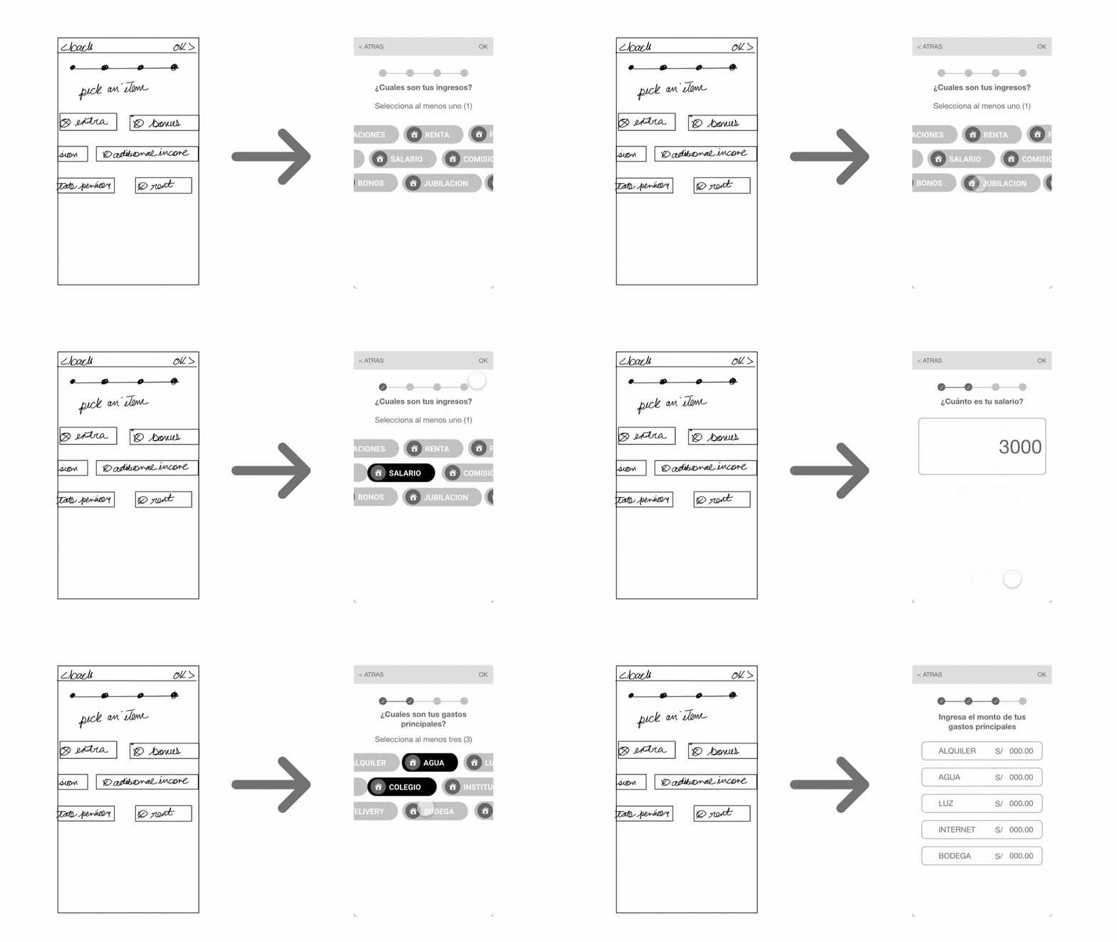
Insights of the second round of usability testing
ⓐ Users found the progress bar helpful.
ⓑ Users proved that many times is better to stick to conventions.
ⓒ Users mentioned that the process was faster this time.
ⓓ The whole process took less than 60 seconds.
ⓔ Users found the progress bar helpful.
ⓕ Users proved that many times is better to stick to conventions.
ⓖ Users mentioned that the process was faster this time.
ⓗ The whole process took less than 60 seconds.
First release
With the pressure of a tight budget, deadlines and having to serve not only our user base but investors (B2C/ B2C), it was challenging to implement all the changes needed in only one new release.
I released our first MVP to improve user engagement and increase ROI.
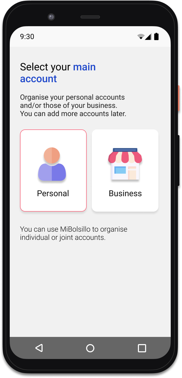
-
![]()
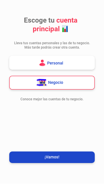
Main Account
Start point
-
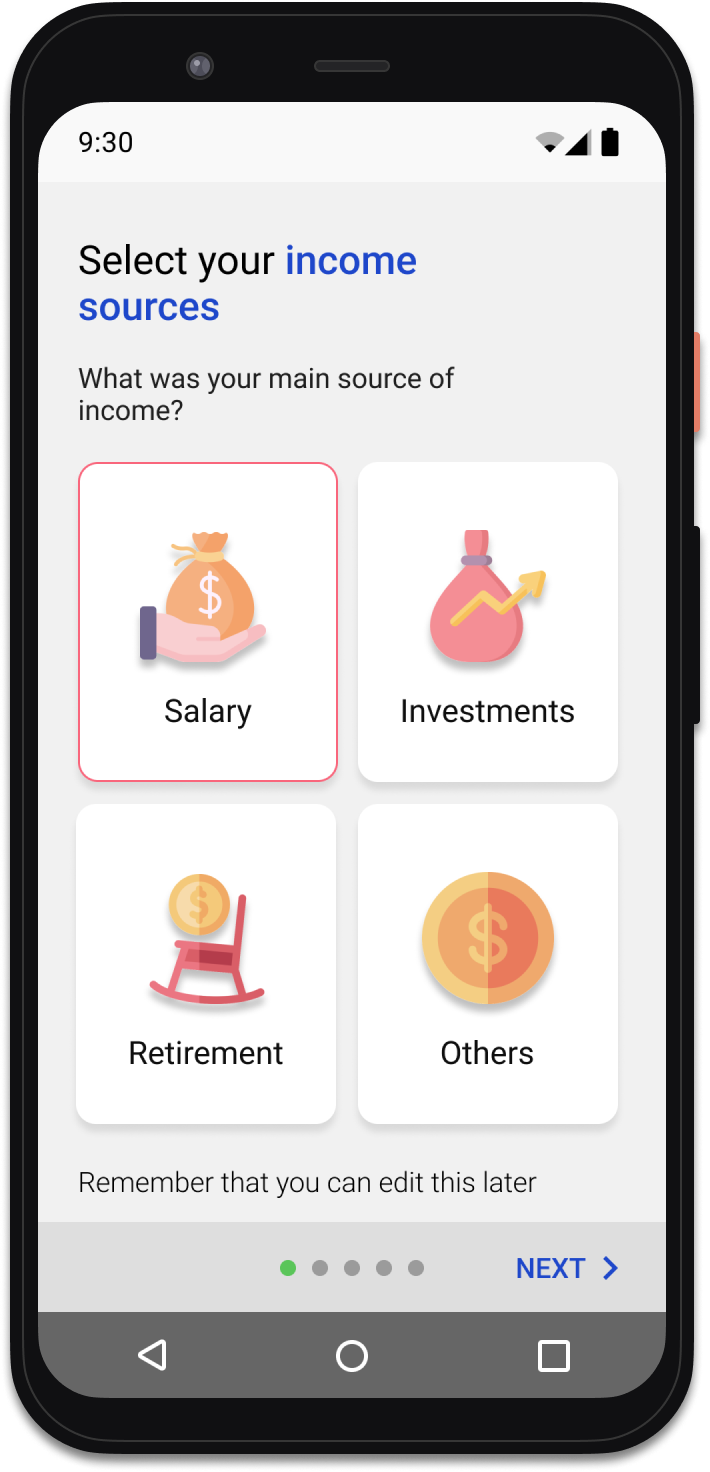
![]()
Income Selector
Big Cards Used
-
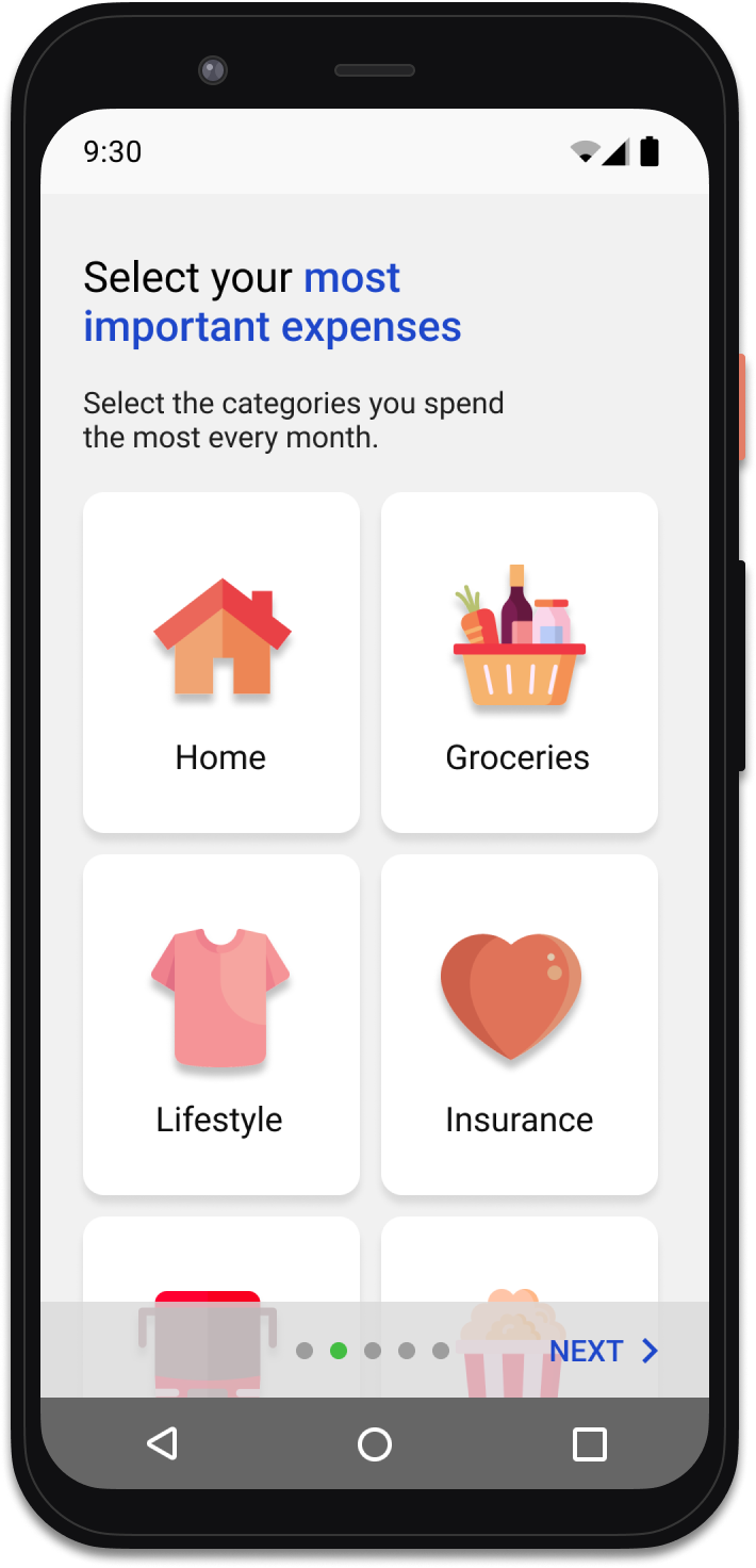
![]()
Expenses Selector (A)
Big Cards Used - A/B Testing Ready
-
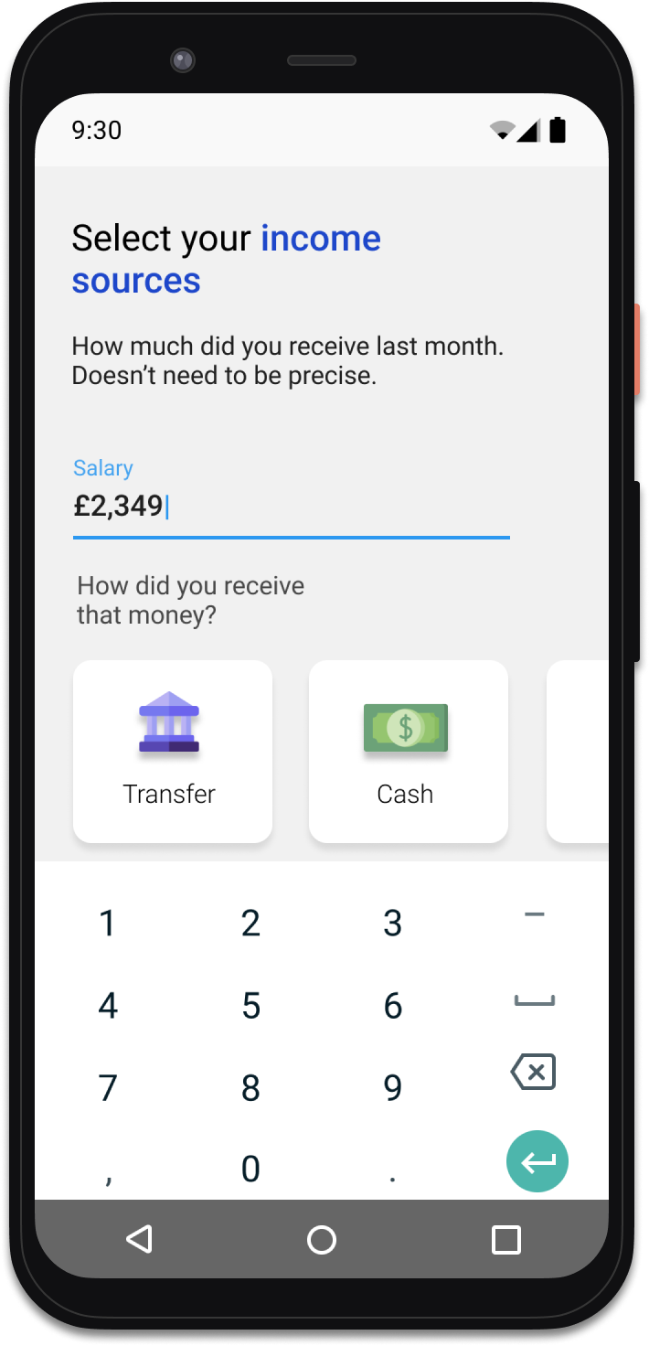
![]()
Input Amount Screen
Mini cards used
Second release
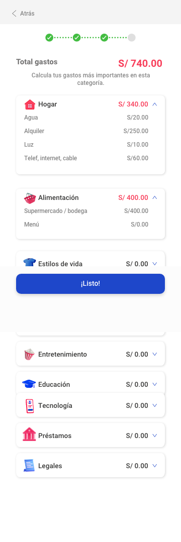
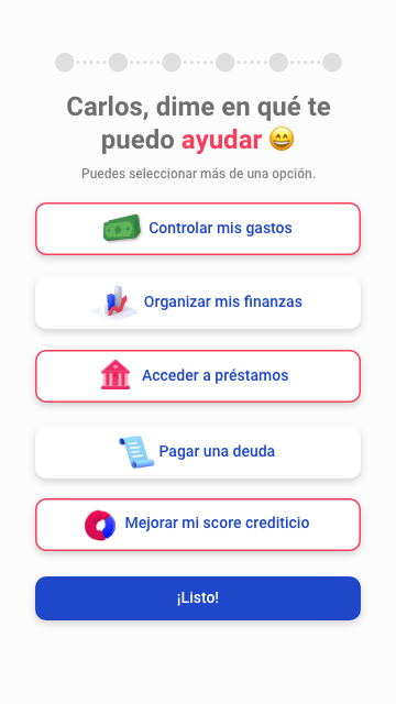
After the success of the MVP, I worked once again to enhance this app's functionality.
This new version retained all the functionalities of the first release with a refreshed look and feel.






Next Project
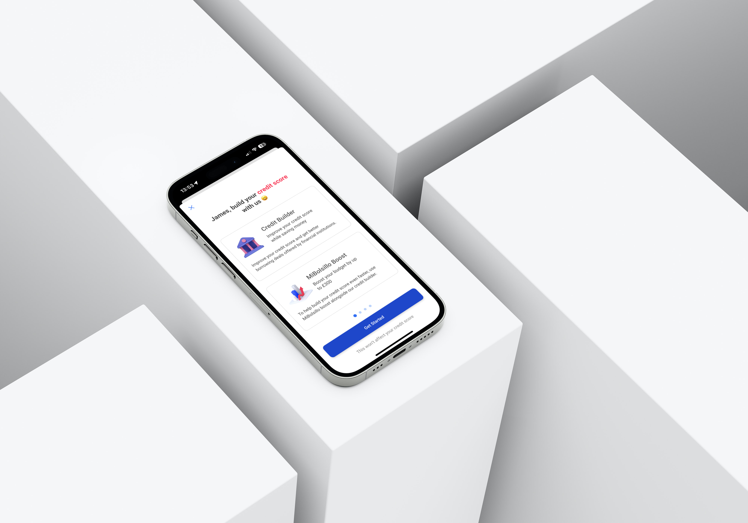
Credit Builder | MiBolsillo App