Summary
Client: Betway UK
Sector: Online Gambling Platform
Challenge: Create engaging infographics & responsive layout
My Role: User Interface Designer | Graphic Design Support
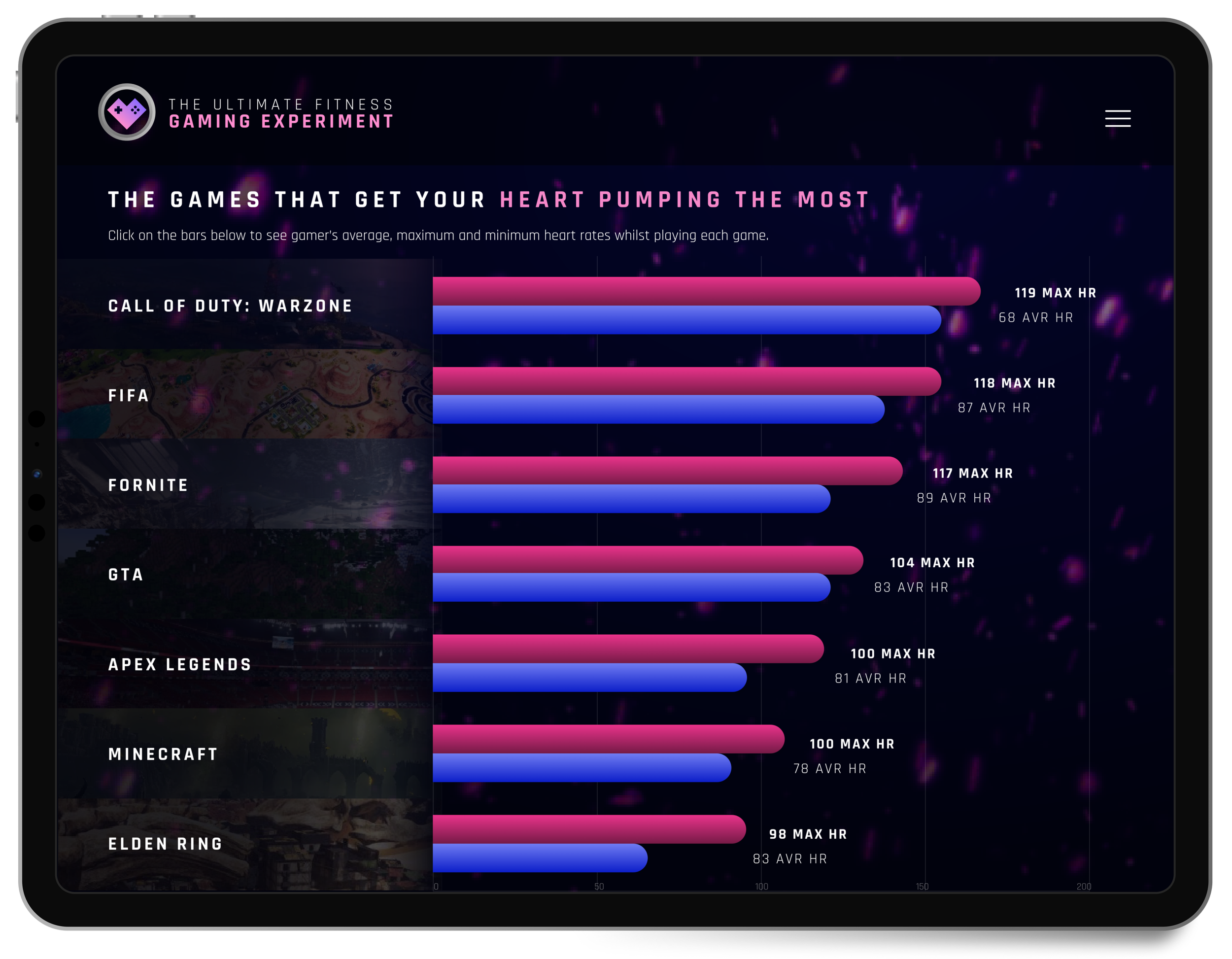
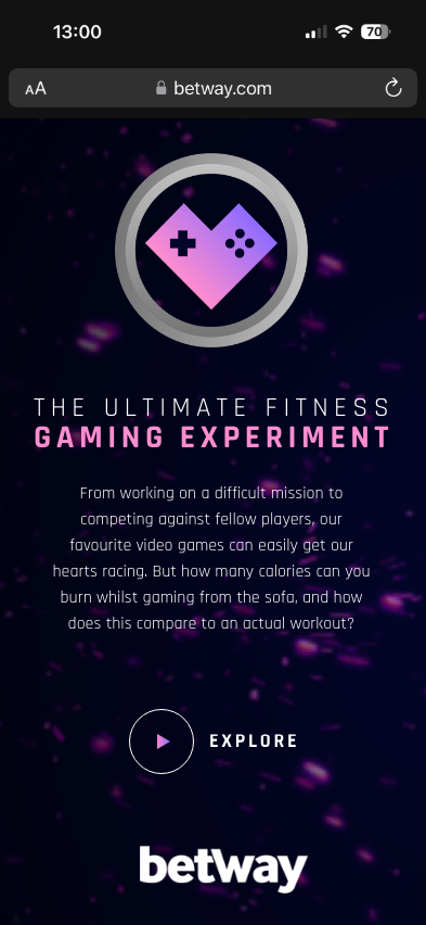
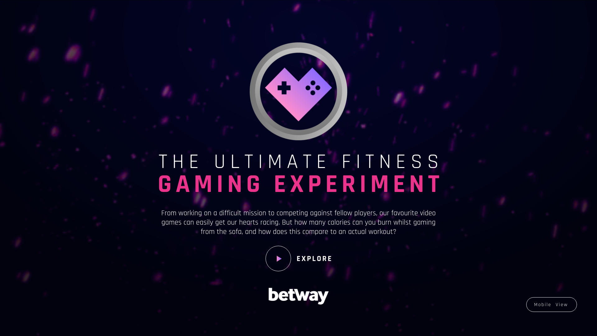
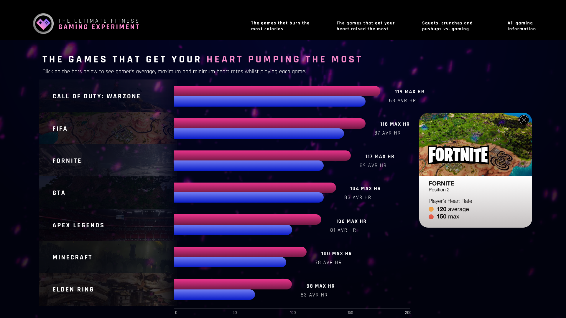
The idea for this project was comparing from working on a harrowing mission to competing against fellow players; our favourite video games can quickly get our hearts racing.
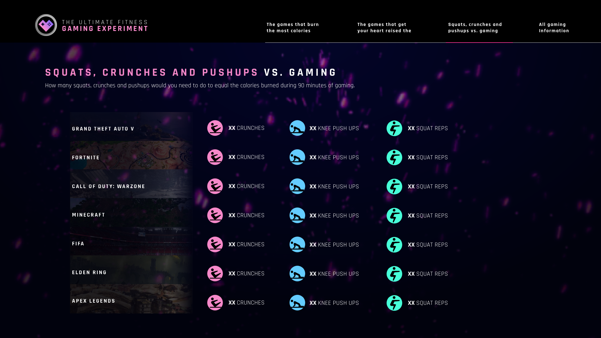
However, how many calories can you burn whilst gaming from the sofa, and how does this compare to an actual workout?
Wireframes
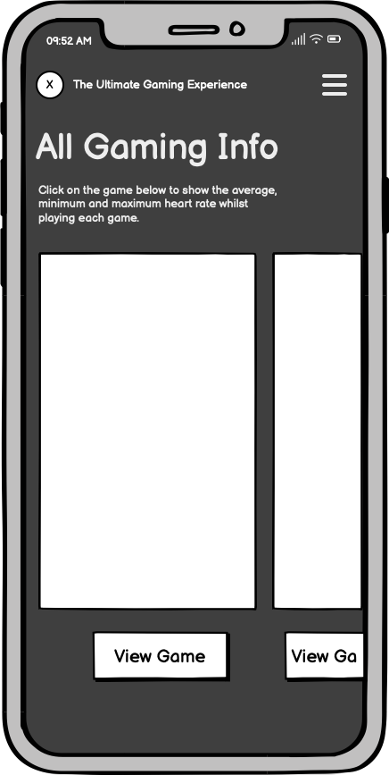
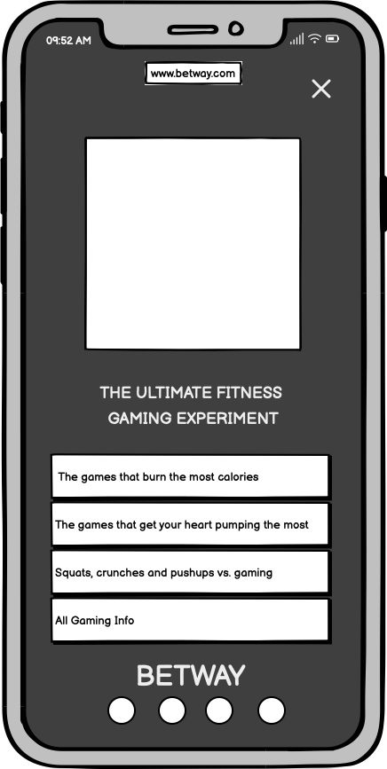
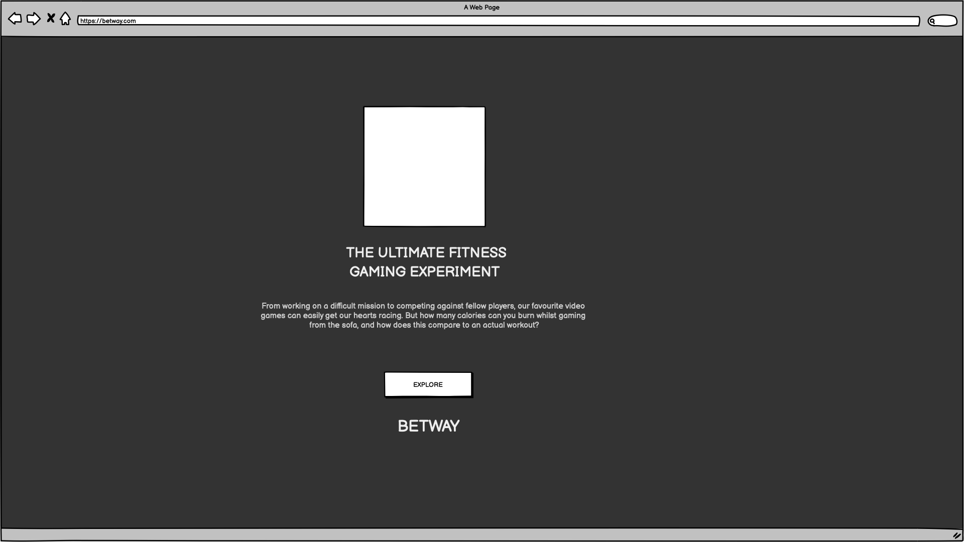
I used a mobile-first approach to this design, prioritizing the mobile user experience during development. It was challenging to display all those statistics on such a small screen actual state. However, when scaling up the design for larger screens like desktops, the task becomes more accessible.
Scaled-Up

Typeface Study
Rajdhani has modularized letterforms. The squared and condensed appearance may be interpreted as technical or even futuristic. Typically round bowls and other letterform elements have straight sides in Rajdhani. The stroke terminals typically end in flat line segments that are horizontal or vertical rather than diagonal. Their corners are slightly rounded, giving stroke endings a softer feeling rather than a pointy one.
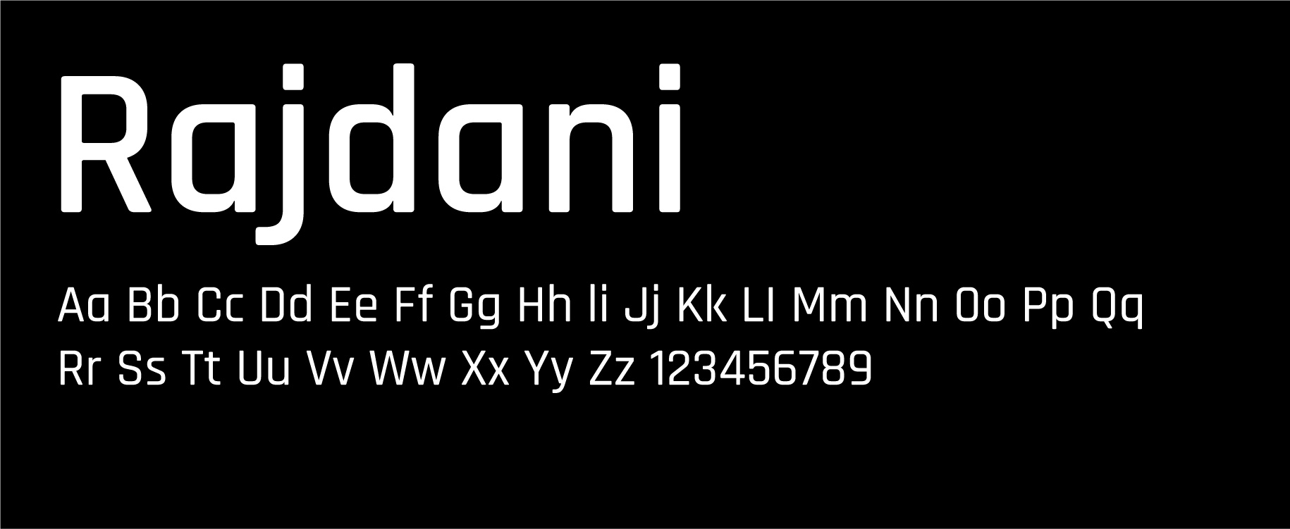
I chose Rajdhani as the typeface because of its readability and versatility.
Sans-serif fonts are known for their clean and simple letterforms, making them highly readable, especially in smaller sizes or on digital screens.
When it comes to displaying statistics on games, the choice was made considering the overall design aesthetic, target audience, and the playful idea of the project.
Colour Palette
I used a neon colour palette to present the statistics for the following reasons:
⚪ Attention-grabbing: Neon colours are vibrant and highly visible, effectively grabbing the viewer's attention. When used in statistics, they can help draw focus to the data and make it stand out.
⚪ Clarity and Contrast: Neon colours typically contrast highly against most backgrounds, which can enhance the legibility of your statistics. The sharp contrast can help distinguish between different data points or categories, making it easier for viewers to interpret the information.
⚪ Modern and Trendy: Neon colours have been popular recently, particularly in design and digital media. You can create a modern, trendy visual aesthetic by incorporating them into your statistics.
#F089D5
#000000
#966EFC
#323649
#47FFD8
#A2A6CO
Design elements
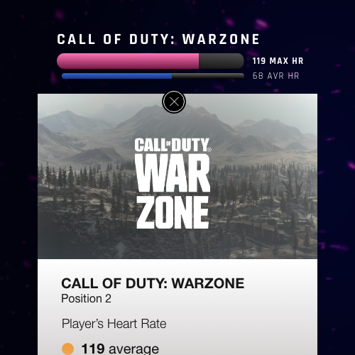
Engaging your audience through design involves creating a visually appealing and user-friendly experience that captures their attention and encourages them to interact with the content.
Here are some design elements I put together to engage our audience.
Hi Fidelity Prototypes
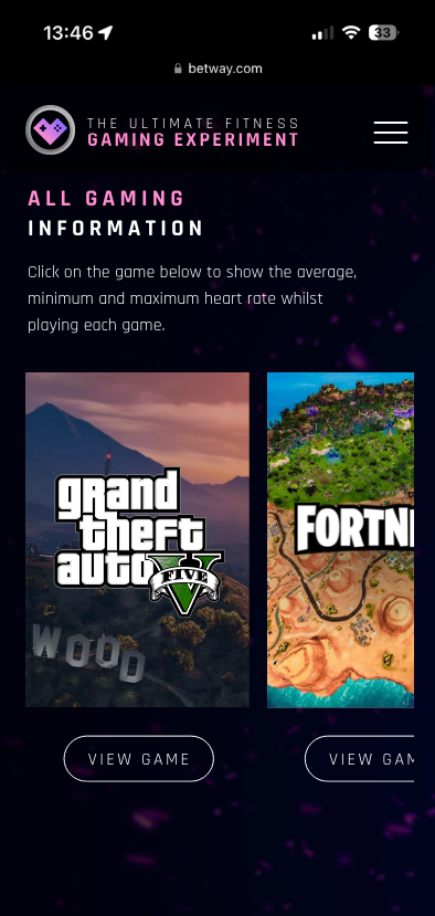
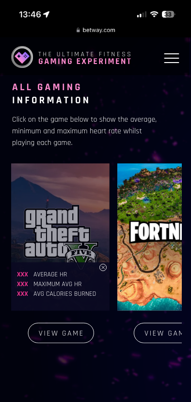
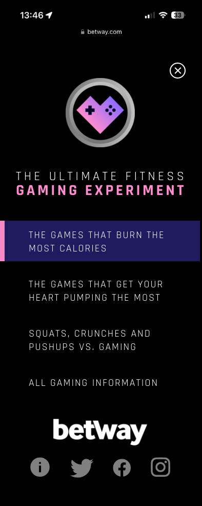
Mobile version flow.
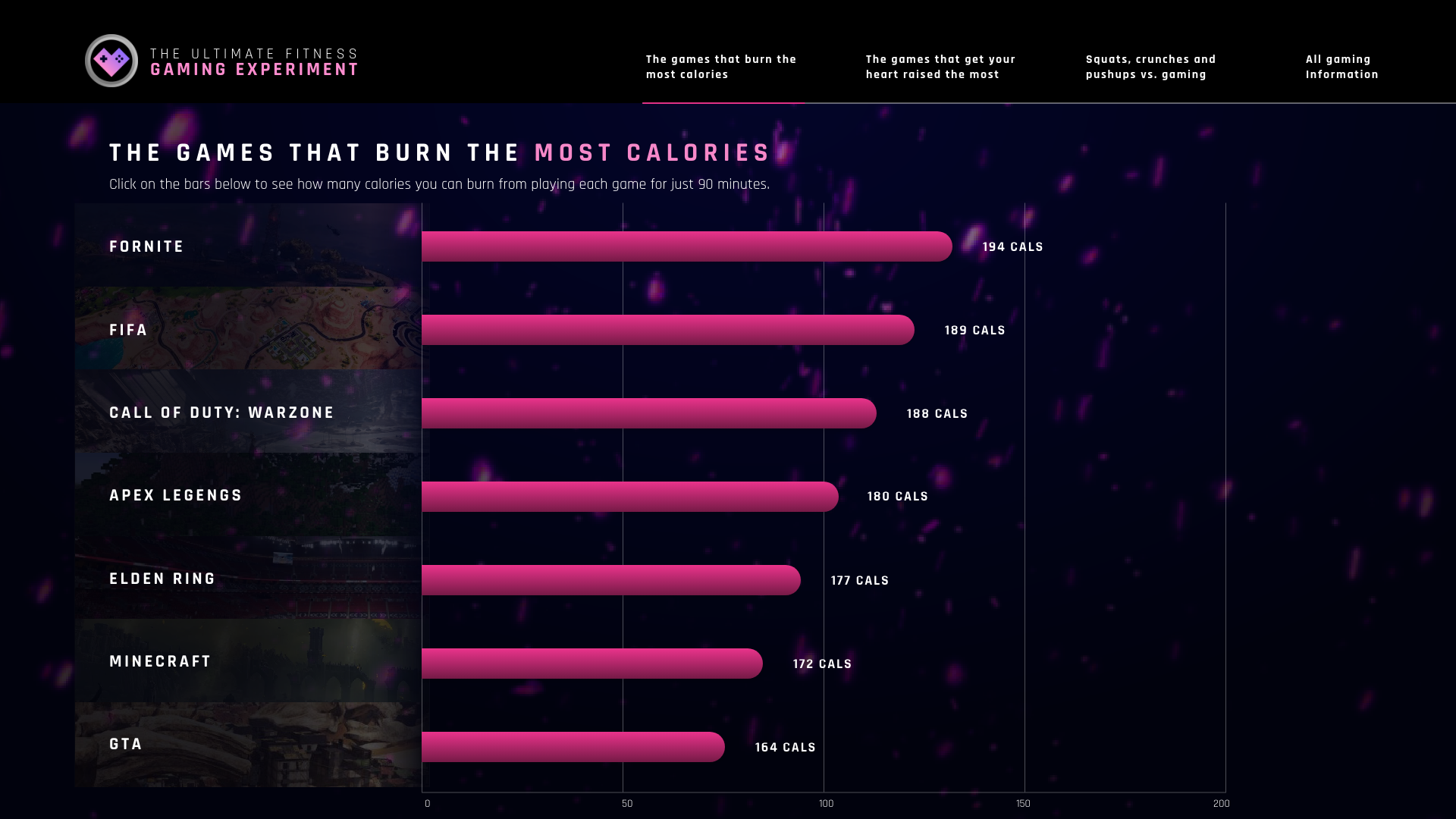
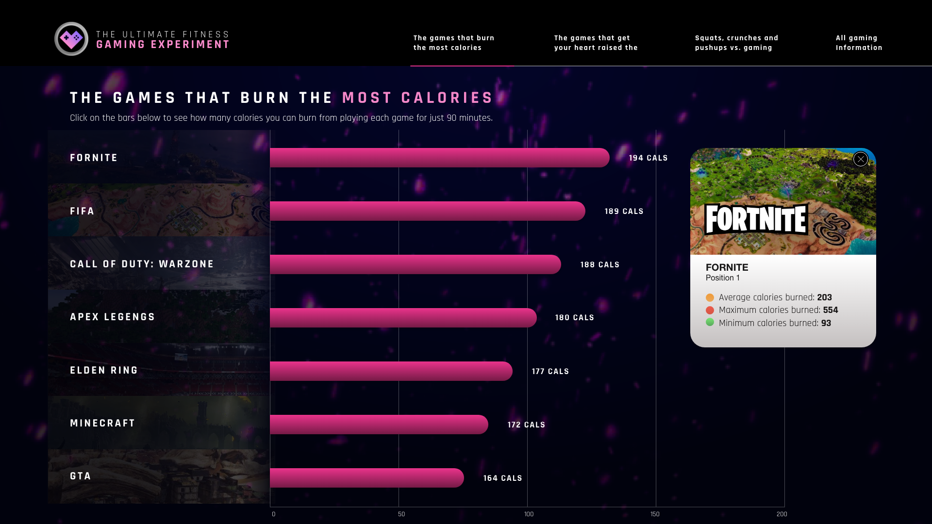
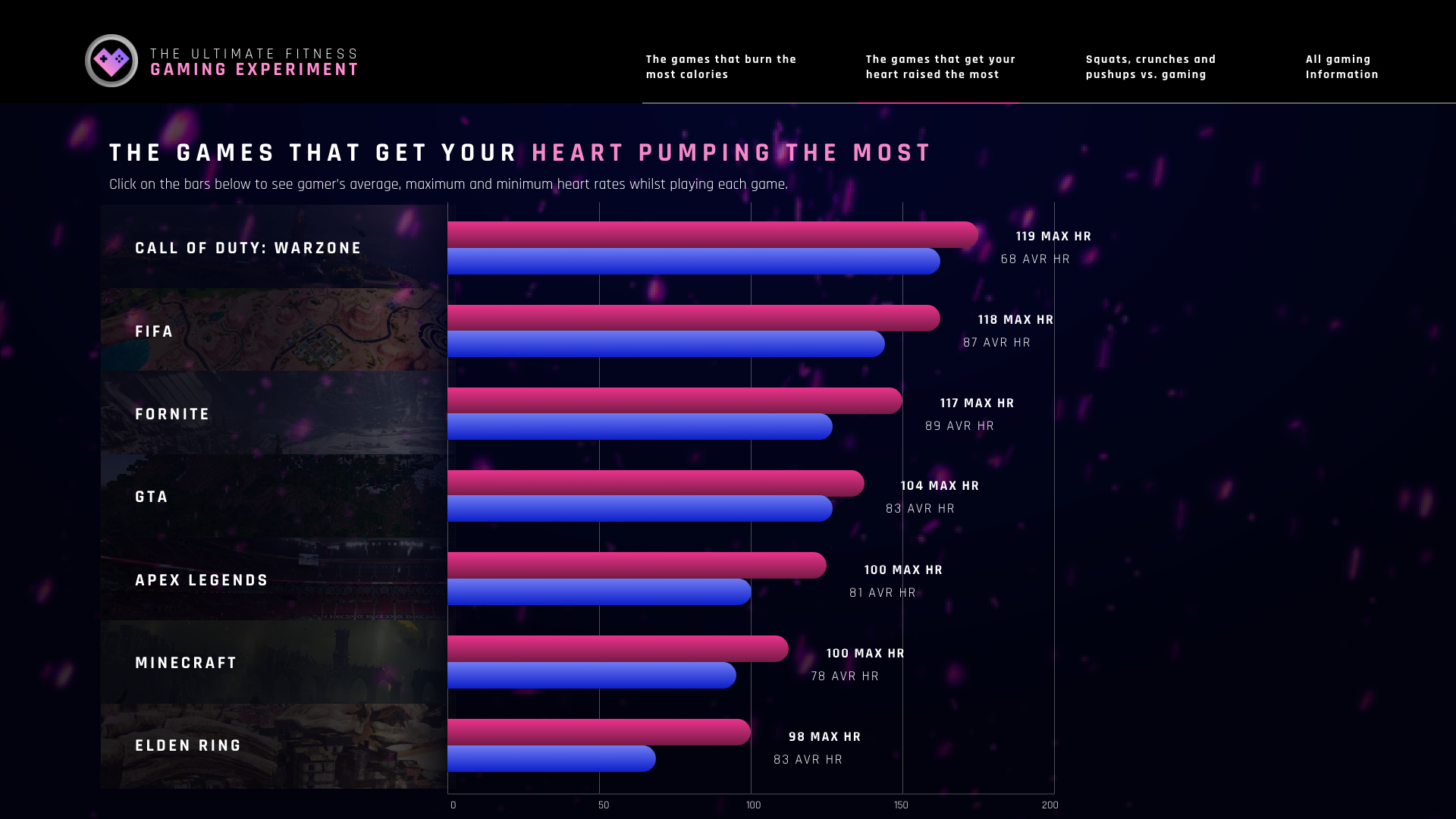
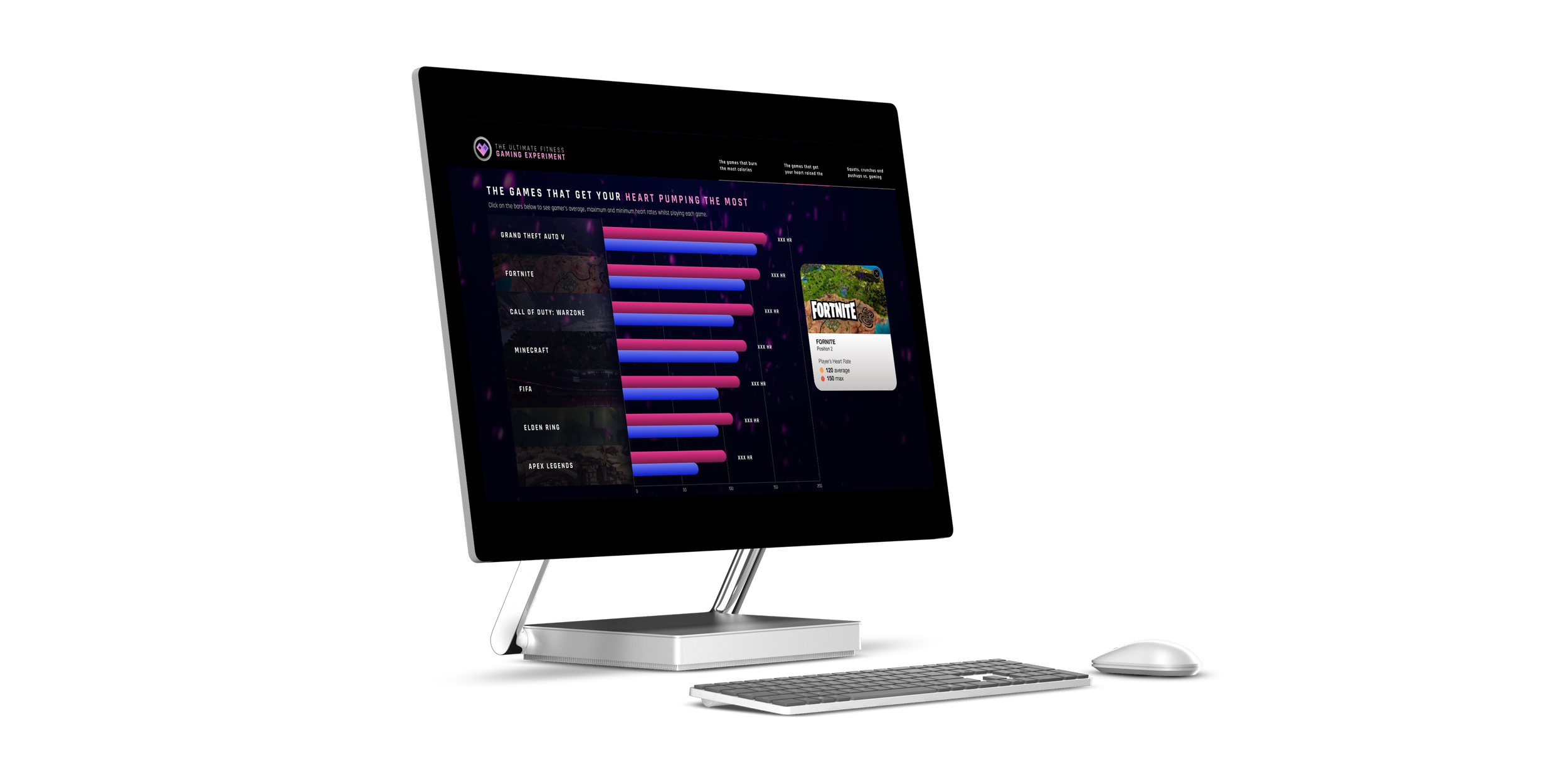
Desktop Hi Fidelity Prototypes
The following prototypes were scaled up from the mobile counterparts.


