



Summary
Client: Landbay
Sector: Fintech
Challenge: Reengineer key dates page
My Role: Staff Product Designer
Overview
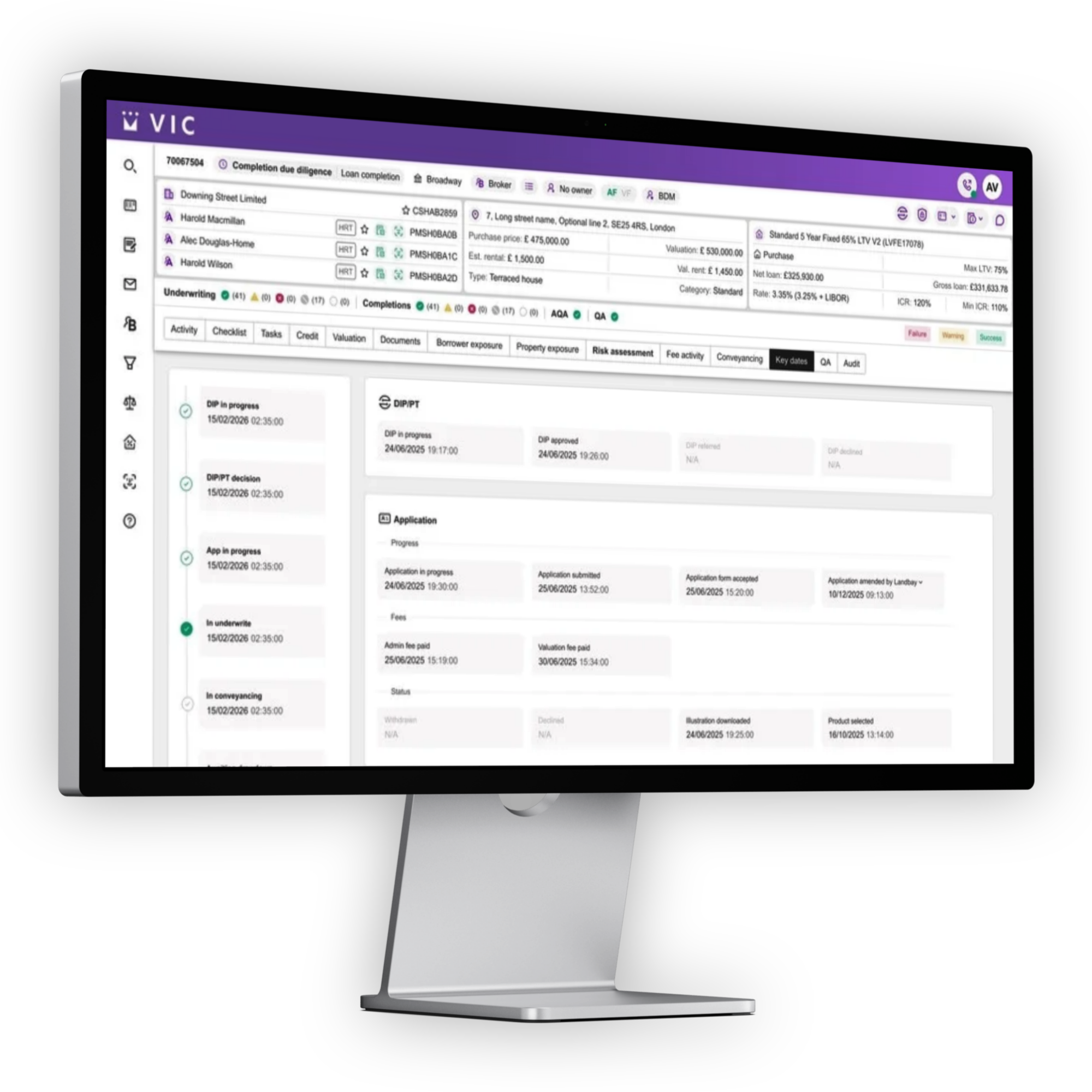
At Landbay, one of the most operationally critical pages inside the broker portal was the Key Dates page, a timeline-style experience used daily by underwriters, case managers, completions, operations, and support teams to track mortgage application milestones.
Over time, the page had become fragmented, visually outdated, and difficult to maintain. Different teams relied on different interpretations of dates, statuses, and priorities, creating confusion internally and externally.
As the Staff Product Designer leading the initiative, I was responsible for redesigning the experience end-to-end: aligning stakeholders, simplifying workflows, improving clarity for brokers, and creating a scalable framework for future case management experiences.
The Problem
The existing experience had evolved organically over several years. What started as a simple list of milestones had become:
Visually cluttered
Inconsistent across platforms
Non scalable
Source of operational friction between teams
The biggest issue was not just UI quality, it was the lack of shared understanding.
Different teams interpreted dates differently:
Operations prioritised processing milestones
Underwriting focused on compliance deadlines
Support teams used the page to troubleshoot delays
Product and engineering struggled with growing logic complexity
As a result:
Teams duplicated effort across communication channels
Internal terminology became inconsistent
Engineering complexity increased with every new feature
The page became one of the most complained-about areas of the portal
My role
Staff Product Designer
I led:
Discovery and UX strategy
Stakeholder alignment workshops
Service blueprinting
Information architecture redesign
UI redesign and design system alignment
Cross-functional collaboration with engineering and operations
Prototype testing with brokers
Rollout planning and adoption strategy
I worked closely with:
Product Managers
Frontend Engineers
Operations teams
Underwriters
Customer Support
Objectives
-
Help users instantly understand:
What has happened
What is happening now
What action is needed next
-
Create a single shared language across teams.
-
Bring the page in line with the wider portal and design system.
-
Enable future products and workflows to plug into the same structure.
Discovery phase
-
To align everyone, I facilitated a series of collaborative workshops focused on:
Mapping existing workflows
Identifying pain points
Defining business-critical milestones
Clarifying terminology
Understanding escalation paths
-
To understand the full impact of the existing experience, I conducted a series of shadowing sessions across Operations, Underwriting, Sales, Customer Support, and Business Development teams. Observing how each team interacted with case information revealed significant differences in workflows, terminology, and priorities.
These sessions uncovered hidden pain points, duplicated effort, and communication gaps that were not visible through analytics alone, helping establish a shared understanding of the challenges and informing a more cohesive redesign.
-
To complement stakeholder interviews and shadowing sessions, I distributed surveys across all teams involved in the mortgage journey, including Operations, Underwriting, Sales, Customer Support, and Business Development. The surveys helped capture perspectives at scale, identify recurring pain points, and uncover areas of misalignment. This quantitative feedback provided valuable evidence to validate findings from qualitative research and helped prioritise opportunities for improvement.
Findings
“I don’t know what I’m waiting for.”
Users struggled to identify the current stage of the application.
“Everything looks equally important.”
The visual hierarchy was weak, making critical information hard to spot.
“Some dates don’t mean anything to me.”
Internal terminology leaked into the customer experience.
“I need to cross-reference emails to understand delays.”
The page lacked contextual guidance and status clarity.
Design Principles
I established four principles to guide decision-making:
1. Prioritise signal over noise
Reduce cognitive overload
2. Make status instantly understandable
Users should understand progress within seconds.
3. Reveal complexity progressively
Advanced operational detail should remain accessible without overwhelming users.
4. Build for operational consistency
The experience should reinforce shared terminology and workflows across teams.
The Redesign
Information Architecture
The original page contained long, inconsistent lists of dates and statuses.
I restructured the experience into:
Current Stage
A clear summary of where the case currently sits.
Key Milestones
A simplified chronological timeline focused on meaningful events.
Upcoming Actions
Clear next steps and dependencies.
Supporting Detail
Expandable operational information for edge cases and support use.
This dramatically improved scanability and reduced information overload.
Visual Design Improvements
The redesign introduced:
Stronger visual hierarchy
Simplified timeline components
Clear status indicators
Consistent spacing and typography
Better accessibility and contrast
Responsive behaviour across screen sizes
Alignment with the wider design system
The new experience felt calmer, clearer, and significantly more modern.
Cross-Team Alignment
One of the biggest successes of the project was operational alignment.
Rather than treating design as a layer applied at the end, I used the redesign process to standardise:
Terminology
Status logic
Milestone definitions
Escalation ownership
Communication expectations
This reduced ambiguity between teams and improved consistency across the business.
The project became as much about organisational design as interface design.
Prototyping & Testing
I created interactive prototypes and tested them with brokers and internal teams.
Key improvements from testing included:
Simplifying milestone labels further
Reducing the number of visible statuses
Highlighting blockers more clearly
Improving empty and edge states
Adding contextual guidance for delayed cases
The revised experience significantly improved task completion speed during usability testing.
Engineering Collaboration
Because the legacy page had accumulated years of technical debt, engineering collaboration was critical.
I worked closely with frontend engineers to:
Simplify component logic
Reduce conditional UI behaviour
Create reusable timeline components
Define scalable interaction patterns
Align implementation with the design system
This helped reduce future maintenance complexity while improving delivery confidence.
Outcome
Business Impact
Following launch:
Brokers reported improved clarity and confidence
Internal support queries related to case progress decreased
Teams aligned around shared milestone terminology
The page became easier to scale and maintain
The redesigned patterns informed wider portal improvements
The project also strengthened collaboration between Product, Operations, and Engineering by creating a shared understanding of the customer journey.
What I Learned
Great product design sometimes means reducing organisational chaos.
The most valuable part of this project was not the UI refresh itself.
It was creating alignment across teams that had slowly drifted apart in how they understood the experience.
As a Staff Product Designer, I learned the importance of:
Facilitating alignment, not just designing screens
Challenging operational assumptions
Simplifying complexity without removing capability
Designing systems that support both users and teams
Key Skills Demonstrated
UX Strategy
Service Design
Stakeholder Management
Systems Thinking
Information Architecture
Design Systems
Cross-functional Leadership
Workshop Facilitation
Product Thinking
Interaction Design
Prototyping & Testing
Operational Alignment
Final Reflection
This project demonstrated how design can act as a unifying force across an organisation.
By reframing a chaotic, outdated page into a clearer and more scalable experience, we improved not only usability for brokers, but also operational clarity internally.
The redesign transformed a fragmented workflow into a shared system that teams could trust, evolve, and build upon.
Next Project
Gaming Statistics | Betway UK